Models, skills, and tools
The infrastructure behind the conversation.
nano-banana-pro model alias. Generated reference images that guided the SVG logo direction. Called through a TypeScript CLI tool (Generate.ts) that wraps the Google API.Brand philosophy
Before a single pixel, we wrote a manifesto.
The session started with a philosophy document — Quiet Infrastructure — that defined the brand's visual language before any code was written. This became the reference point for every subsequent decision about color, typography, and composition.
Capital moves like water through soil — invisible, patient, essential. This philosophy treats financial infrastructure not as machinery but as living systems: layers accumulating, value percolating downward and upward simultaneously, growth emerging from decomposition.
— compost-philosophy.mdThe palette must feel institutional yet alive, as if a Swiss private bank discovered permaculture.
— on colorWords are sparse, clinical, confident. Thin sans-serifs in small point sizes — the typography of serious infrastructure, not marketing.
— on typeHorizontal bands — sedimentary layers suggesting accumulation
Earth tones anchor; living green appears sparingly
Negative space isn't emptiness but potential
Asymmetry creates interest; balance creates trust
Compost as metaphor: decay becoming fertility
The eye moves slowly — compounding cannot be rushed
Logo evolution
Image generation for direction, then 26 SVG iterations through conversation.
The Art skill generated reference images using Gemini 3 Pro — visual concepts that established the direction before any SVG code was written. The image below guided the core idea: a shoot emerging from stacked soil layers.
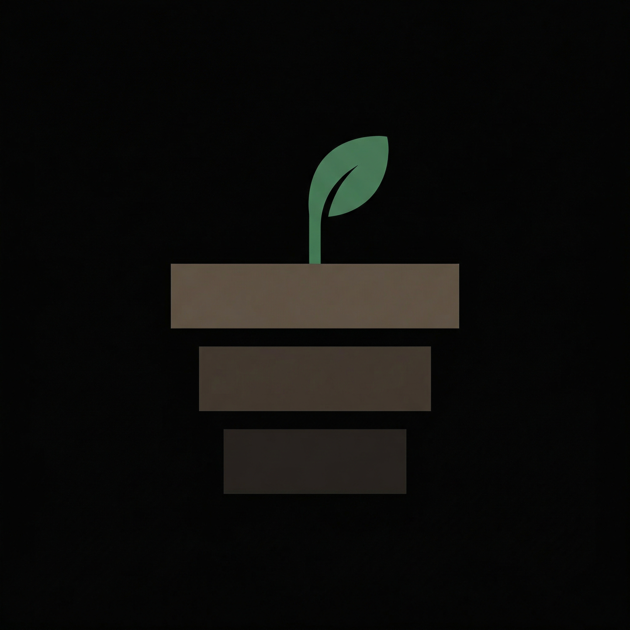
Generated with Gemini 3 Pro Image Preview via the Art skill. This informed the visual language — the shoot, the earth-tone layers, the minimal composition — which was then translated into hand-coded SVG paths.
Wordmark exploration
Testing case, weight, and tracking to find the right typographic voice.
With the mark finalized, the next question: how does text pair with it? We explored case variations, font weights, and letter-spacing systematically — testing each combination on dark and light backgrounds before committing.
Weight 200 with 0.12em tracking. Reads as quiet infrastructure — the typography of Swiss private banks, not crypto marketing. The ultra-light weight forces the eye to slow down.
The .fi TLD becomes a design element. We tested muted, green (tying to the shoot), and weight differentiation.
Three lockup variants for different contexts: horizontal for headers and inline use, stacked for square formats, and text-only for footers and inline references.
Testing lockups in realistic contexts — footer, docs header — to ensure they hold up at actual usage sizes.
Design system
CSS variables, type scale, and lockup variants extracted into reusable tokens.
Landing page
From brief to production through conversation-driven iteration.
The first draft was conventional — hero, value prop, features, CTA. It worked but felt generic. The frontend-design skill's guidance against "AI slop" aesthetics prompted a rethink.
"Too safe. Reads like a template." This kind of directional feedback drove the iteration. The AI executes fast; the human has to know what's wrong.
The page was restructured around a 4-beat narrative instead of a feature list. The philosophy document provided the framing — tension between patience and opportunity.
The shoot animation became the signature moment — the mark growing on page load. The core metaphor, on entry.
.hero-mark .shoot {
  animation: grow 2s ease-out forwards;
  transform-origin: bottom center;
}

@keyframes grow {
  0% {
    opacity: 0;
    transform: scaleY(0) translateY(20px);
  }
  50% {
    opacity: 1;
  }
  100% {
    opacity: 1;
    transform: scaleY(1) translateY(0);
  }
}
Platform debugging
Browser quirks, meta tags, and image format requirements.
iOS Safari viewport. The hero section used 100vh which doesn't account for Safari's address bar. Fixed with min-height: -webkit-fill-available as a fallback.
Meta tag debugging. Open Graph images need absolute URLs and specific dimensions. Twitter cards have their own tag format. We tested with multiple sharing debuggers until previews rendered correctly across Twitter, Telegram, and iMessage.
SVG to PNG for Telegram. Telegram doesn't render SVG in link previews. We exported the logo to PNG at 1200×630 for the OG image — the only raster asset in the entire project.
Favicon at multiple sizes. SVG favicon for modern browsers, with the mark simplified at 16px and 32px sizes so the leaf detail remains legible at small scales.
Git timeline
15 commits from philosophy to production.
How it worked
The mechanics of the AI-assisted workflow.
Image gen → SVG workflow
Gemini generated reference images to establish visual direction. Those references were then translated into hand-coded SVG through iterative conversation. The AI-generated image was a sketch, not a deliverable.
Skills as packaged expertise
Custom skills (Art, frontend-design) bundled domain knowledge and tool integrations. The Art skill wrapped image gen APIs; frontend-design provided aesthetic guardrails. Reusable across projects.
Subagents for parallelism
Haiku handled file exploration and search while Opus focused on creative work. ~340 subagent calls for codebase exploration meant faster context-gathering without burning expensive tokens.
SVG as version-controlled design
Raw path data instead of binary assets. Each logo iteration was a diffable code change. No Illustrator exports, no asset pipeline — the SVG code is the design file.
Human taste, AI execution
"Tighten the leaf curve." "Too saturated." "Reads like a template." Every creative decision was human-directed. The AI wrote code fast; the human judged whether it was good.
~2,600 API calls total
Not a quick demo — a real working session. Philosophy document, 26 logo iterations, brand guidelines, complete landing page, responsive CSS, animations, meta tags, and this process page.